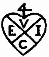

I’ve started watching the BBC’s new period supernatural drama ‘Taboo’, and right away noticed something weird about the depiction of the East India Company in the show. It’s not the setup for them being a sort of Georgian version of OCP from Robocop, although that is historically dubious in itself. No, what I noticed was the bizarre choice of the EIC ‘logo’ from the ‘Pirates of the Caribbean’ movies. As the Radio Times points out, the company trademark (or ‘bale mark’) symbol did change over the decades, but they seem to think that the one used here is a real historical one. It absolutely isn’t, it’s the exact same one from the ‘Pirates’ movies. Given the casting of Jonathan Pryce, I half wondered if this was some sort of weird spinoff/crossover effort, but that seems to be coincidental. The correct bale mark is the heart-shaped one with the ‘4’ shape on top (an old merchant’s symbol), and ‘VEIC’ for ‘United East India Company’. The only real change was a move from curved segments to quarters, see here.

for 1813 (the year that the programme is set in) would be the one I’ve posted above. This was used on their currency, stock and property in a similar fashion to the Board of Ordnance ‘broad arrow’, though frankly I haven’t seen the ‘heart’ on anything dated post-1808 (anyone that knows the real history here, please do comment). Certainly it was dropped from the Company’s firearms and replaced by a lion rampant from that date onwards. I’m also not sure that it’s appropriate plastered all over their HQ as it is in ‘Taboo’ – I suspect that the coat of arms should be the official ‘logo’ in that context (see this page). I have a nagging feeling that some researcher simply bashed ‘east india company’ into Google Images, which is dominated by the Disney EIC ‘logo’ in screengrabs, merchandise and wiki pages, and assumed that it was one of the real historical variants. If so, how incredibly lazy can you get? If not, what’s the big idea here? Why connect your dark gothic adult historical drama series with a series of light-hearted family movies based on a theme park ride? Yes, I realise most people won’t know or care, but if I thought like that, I’d never write anything here!
I’m not the only one, in fact. Some people on Reddit have also spotted this, and one theory is that they chose the fictional logo to emphasise that this is a fantasy version of the company, but a) what would be the need, and b) why go to the trouble of seeking copyright permission from Disney to use their version, when you could easily design your own. Wait, you did seek permission from Disney, didn’t you, BBC? BBC….?
I also noticed from recently watching the pirates of the carribean dead man’s chest that they show a scene of the East India company and sir stuart there as a worker and then I was blown away, bevause he is in taboo as well as part of the company as well, I wonder if that is coincidence or is it a sequel thing of some sort just like you said.
I think there’s a sensible explanation here – there’s a tea ware company with the same name who use the merchant mark as their logo, and presumably wouldn’t allow it to be used.
That’s a very sensible explanation, but it doesn’t explain why they chose to use Disney’s (copyright protected!) version in lieu of that.